Relaunching a new way to Wal-Mart Pay
To continue reaching a growing younger customer base—spending more time on their phones—Wal-Mart has been focusing on developing mobile tools that can evolve with them. In 2014, Apple, Samsung and other companies successfully launched pay-by-phone services, inspiring Wal-Mart to launch Wal-Mart Pay in 2015.
My Role
Working directly with the Lead User Experience Researcher and Creative Lead, we were responsible for a complete redesign of the Wal-Mart Pay Android and iPhone applications. The lead and I gathered current and future requirements, research results (from in-store and lab testing) and developed wireframe-to-prototype documents.
The Starting Point
I started by gathering feedback from various sources to get an understanding of who are Wal-Mart users. Looking at internally produced user testing reports, app store reviews, personas and our own benchmarking review. I also evaluated the previous version of the app against Neilson’s 10 heuristics metrics.
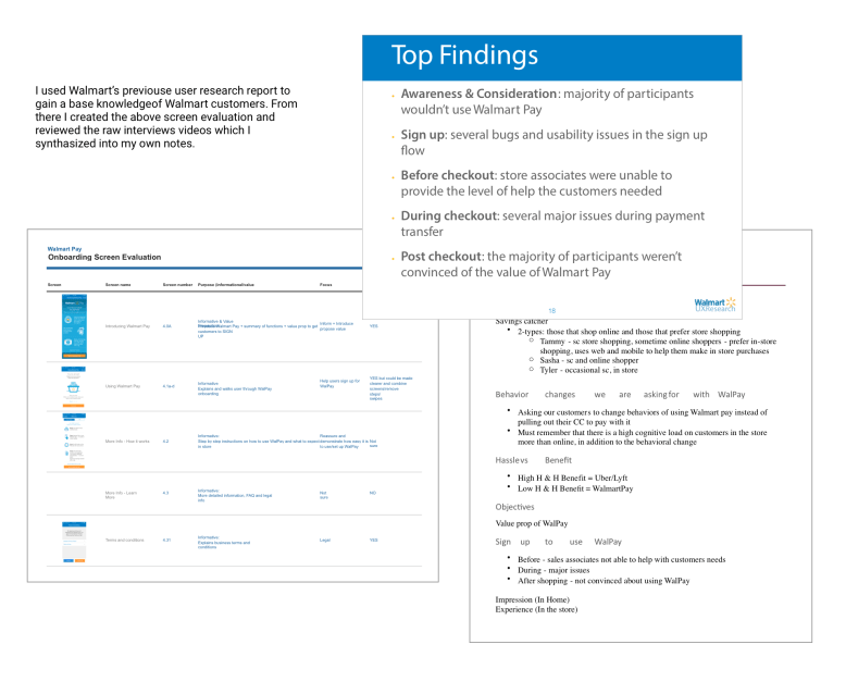
While digging through the research, we found that Wal-Mart customers do not describe themselves as technologically savvy, and that over 50% of customers were using 2nd or 3rd generation mobile phones, such as iPhone 4 and Nexus 5. Most users of pay-with-your-phone apps, in contrast, were early adopters and enjoyed the efficiency and novelty of the one step buying process, which didn’t exactly match with the current traditional Wal-Mart persona.
Also, many Wal-Mart customers didn’t trust their phone with sensitive information such as credit card numbers. That required us to gain their trust and offer less intrusive options such as cash and gift cards.
Finally, we noticed there was a big bounce rate during the sign up process.
With this knowledge from our discovery process, the Lead UI designer and I started to develop concepts and compile a list of goals for the next release.

The Challenge
With such a small team, we knew we had to focus our efforts on a few features that would have the most impact. We also received a requirement from the Product Manager that the happy-path purchasing flow could only involve three steps to complete a purchase.
There were two processes where confusion could happen:
- during sign up, and
- during the checkout process.
We decided to focus on the onboarding process first, since there were high bounce rates and confusion errors among customers. We also looked at the onboarding process as an opportunity to increase education around the checkout process earlier on in the path of the user. This, we hoped, would reduce the confusion during checkout. Next, we focused on redesigning the checkout process. Our goal was to make the checkout experience as smooth, clear and concise as possible.
With this focused strategy, we looked to sketch and ideate solutions to our consumer’s problems to reduce bounce rates and increase purchases completed through Wal-Mart Pay.
The Design Problem
The Wal-Mart Pay app was released both on iPhone and Android systems, meaning that designs and solutions had to be compatible with both platforms. We also wanted to maintain consistent visual aesthetics and user-flows across both mobile platforms. Therefore, our first challenge was to work within an already familiar flow structure that customers have already grown accustomed to.
Asking Wal-Mart customers to change a fundamental shopping behavior—paying at the cash register, with their phones, with a credit card—represented a significant challenge. Research showed that many customers paid for their purchases with a mixture of payments, for example cash and credit card, or two different credit cards. Why would customers change a behavior that they feel comfortable with, trust and is flexible when using multiple payment methods?
In addition, in-store signage was placed near cash registers and included a QR code, which new users scanned to sign up for Wal-Mart Pay. Unfortunately, a similar behavior is asked of existing users during the in-store checkout process through Wal-Mart Pay, which caused confusion for customers who were already signed up.

The Research
Taking information from the in-house research team and doing research on my own, I discovered many opportunities for improvement throughout the onboarding and the checkout flow.
Evaluate the existing system
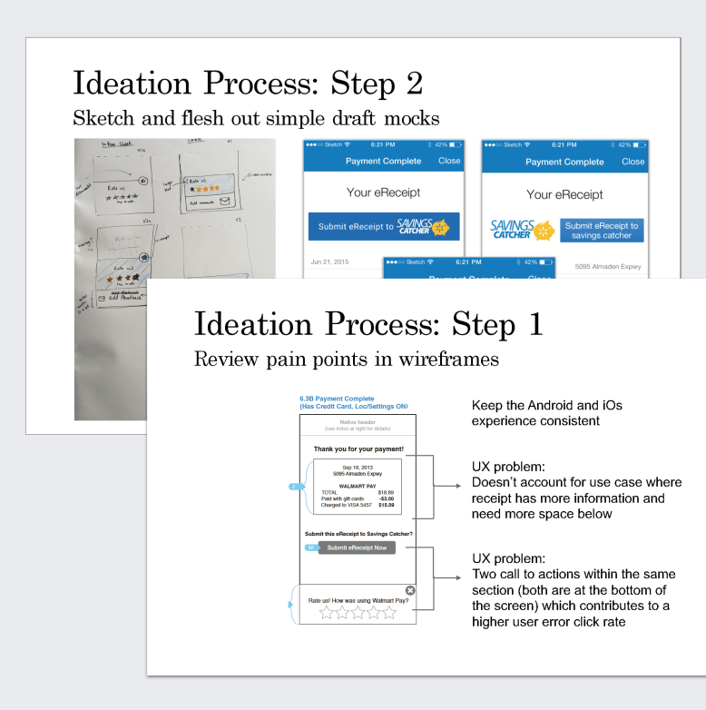
First, it was important to identify opportunities for change, since I was starting on an existing application. I created an onboarding screen-by-screen evaluation to determine which screens were required or essential, what information should be prioritized, and what was extraneous.
Through this process, I discovered that the current app was presenting excessive information compressed into one screen. Additionally, the information presented wasn’t crucial to the user’s decision-making process at that particular time.
Understand environment and scenarios
Next, since context and environment were critical to understanding the user experience, I sketched out user scenarios in order to better understand how the checkout process currently stood, and how it should ideally function with the addition of Wal-Mart Pay.
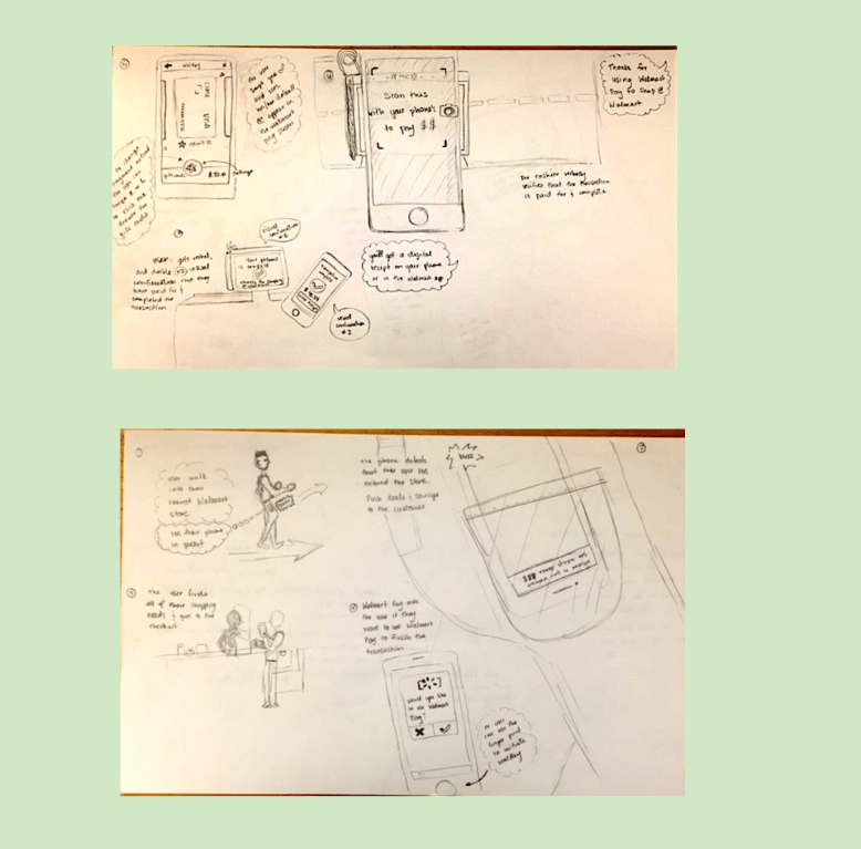
The current checkout procedure did not require the involvement of a mobile device before or during the process. Sometimes, if a customer already participated in the Wal-Mart loyalty program, Savings Catcher, they would be prompted to scan their paper receipt from the cashier with their mobile device. In general, using a mobile device during checkout was still a new experience for Wal-Mart customers. That meant we had to clearly guide and reassure customers throughout this new experience.
All of the competitor apps asked customers only to place their mobile phone near the pay stations to initiate payment. In contrast, Wal-Mart had been asking customers to scan or “snap” a QR code to authorize payment. During testing we found that scanning a QR code provided more opportunities for error because:
- There could happen to be signage in and around the store that contained QR codes unrelated to completing the transaction process causing confusion
- When QR codes were scanned, the application had high rates of error, causing customers to try scanning it again
This meant that we had to quickly educate the user in order to drive adoption of this new way of paying.
The Result
Armed with our research, I turned my focus on updating the flow and design of each page to incorporate our findings.
The first task was to break down the sign-up information page into more digestible chunks and highlight the safety features that our research revealed was crucial to Wal-Mart customers.
I took the original informational setup screen and tried a couple different options, first splitting it into three screens and only having one chunk of information (e.g., security features, convenience, etc.) per screen. Another mocked-up version highlighted the important information and took the user directly to the set up flow unless they chose an option for more information.
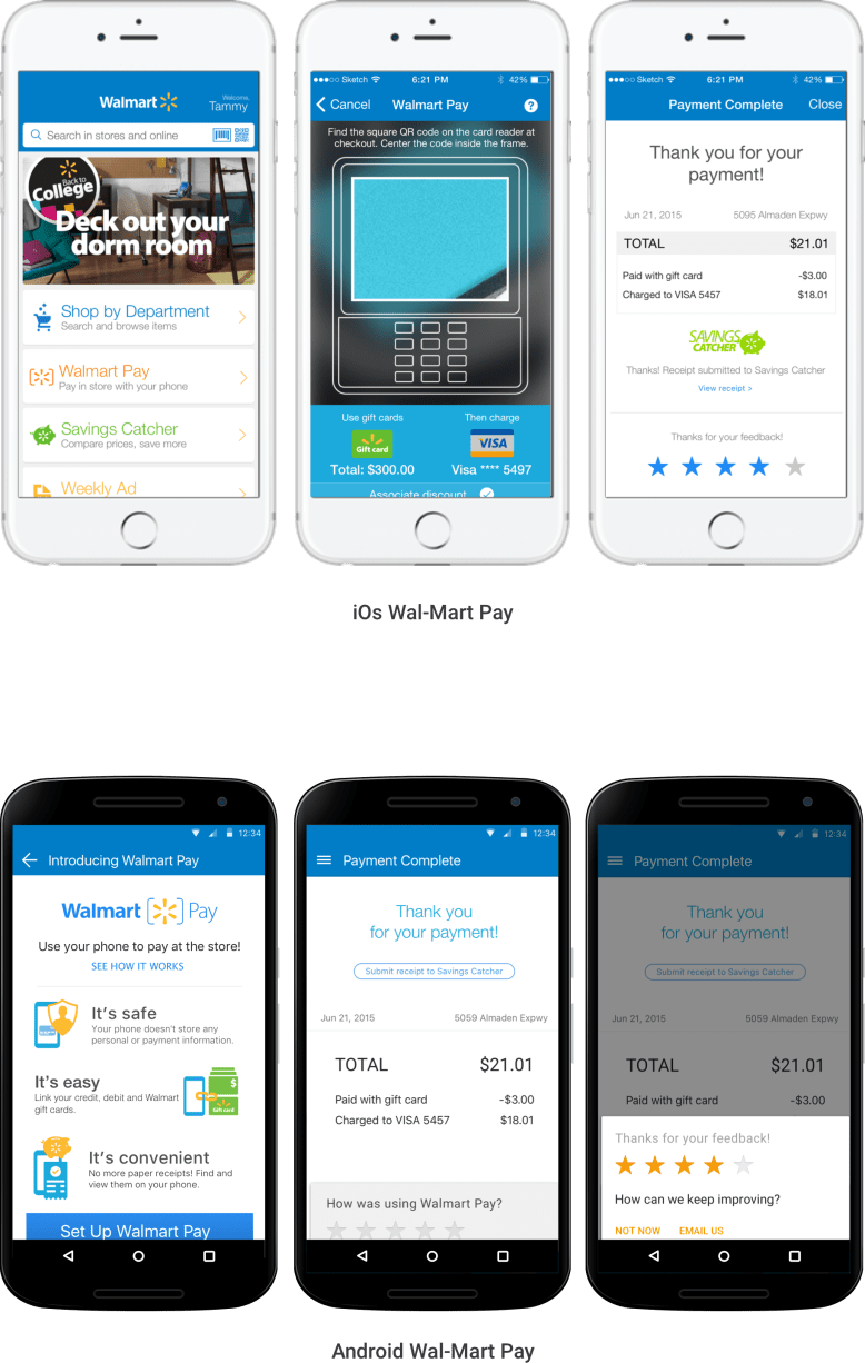
Next came the scanner screen, which originally had a more than one call to action. We reduced that to a single action—scanning the QR code to authorize payment. We also redesigned it to include subconscious queues, such as a translucent overlay image of a POS system as the lens through which to scan the QR code. This design guides the user to the correct QR code that would appear on the POS system during checkout.
Lastly, to address a confusion issue we saw in testing, and create even more transparency around payment, we created a new screen just before the final payment screen. It prompts the customer to confirm which payment method(s) would be used (e.g., using a gift card and then a credit card for the remaining balance), and allows multiple forms of payment for one transaction. This helped reassure and put the customer in control of the payment(s) in the transaction.
The updated application was beta tested in certain California stores in the winter 2016-spring 2017, and is waiting for another round of feedback and testing before its final version release.