
Ariake Mobile and Website redesign
Expanding in a crowded Western retail market
After establishing its success in East Asia and Europe, Uniqlo turned its focus towards expanding in the United States. In 2016, Uniqlo’s strategy to attracting more customers included re-designing a mobile experience especially tailored to Americans and their shopping behaviors.
My Role
I collaborated with a team of 5 people (including designers, UX and UI professionals and the creative director) to re-launch the Uniqlo mobile app and desktop website. For certain parts of the app, I gathered previous concepts that had been commissioned out to a firm and reconciled it with current Japanese designs. In addition, I merged new design features that had been created in-house and composed design guidelines, style guides, and full mockups.
The Challenge
Uniqlo is a global company with stores in the US, Europe, China, East Asia, and Australia. Our design strategy needed to incorporate different e-commerce behaviors and purchasing trends that would later be adapted for each of these different markets.
An additional challenge stemmed from working without requirements and weekly revision meetings. This encouraged us to initiate our own research, design based on best practices, then validate feasibility through revisions and trial & error.
Our unique challenges included having to adapt Japanese typography and visual balance while using Western characters. Because Japanese typography can express a lot of information in a few characters, Japanese speakers are accustomed to quickly processing large amounts of information.[1]
Also, Japanese characters are smaller in height than Latin characters. As a result, simply translating Japanese text into English while preserving the original design would go against Western best practices. Finally, Japanese only has one style, no italics, bold or underline, making organizing with visual hierarchy more difficult.
Approach
A Global Market
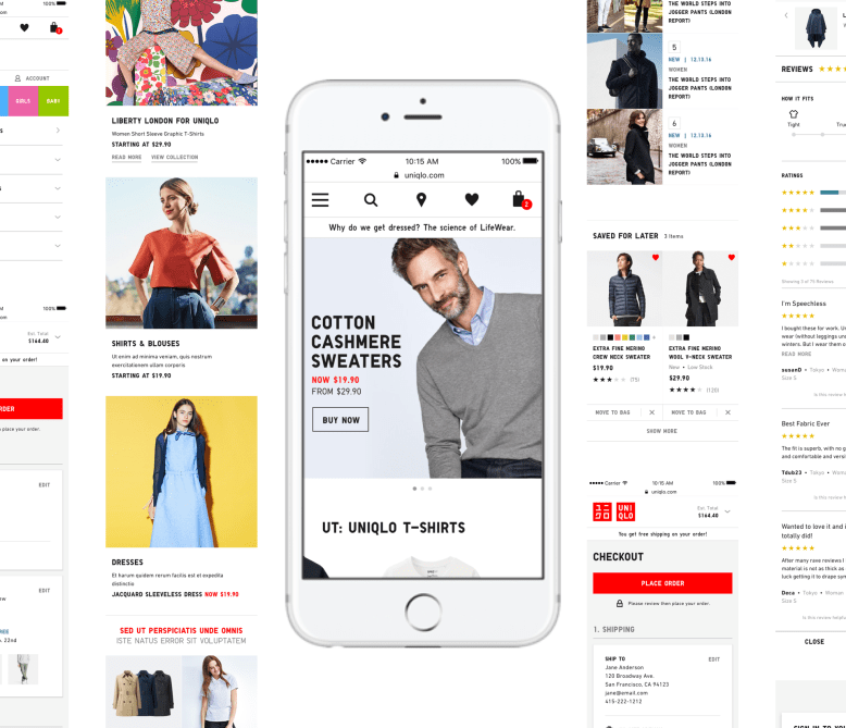
Uniqlo is a well-known brand throughout East Asia and Europe, and is focused on expanding in the United States and Canada. The previous app developed for the American market was clunky and complicated, resulting in a poor customer experience. It was eventually taken down, creating the need for a redesign focused for a Western market.
Since the previous English app was closely based on the Japanese version, it mimicked an experience consistent with other Japanese and East Asian mobile retail platforms. From the site architecture to checkout behaviors, the interface solved for Japanese purchasing behaviors, which were different from trends in the US.
Creating Systems
Since I was jumping into a project for an already established world-recognized company, my task was not only to create beautiful designs that echoed the larger brand, but also to create a systemized process of design that could be used in a modular fashion across a range of mobile platforms, operating systems and culturally driven shopping behavior.
The Framework
Uniqlo’s brand has a very good reputation in Asia. Loyal customers go to its 1,500 locations for basics such as undershirts, socks and tights, its performance products (Ultra Light Down), good quality fabrics, carrying styles and patterns year-to-year (Heattech) at reasonable prices and spend an average of (**insert figure for yearly sales in 2016) per year.
In the US, however, Uniqlo does not have the same brand recognition as in Asia or Europe. In addition, the brand’s principal competitors—Gap, H&M and Zara—are giants who have operated in the U.S. and Europe much longer and have built strong brand recognition.
Operating from this brand disadvantage compelled our design team to provide a highly tailored experience & design to American and Western shoppers.
To start off the redesign, Uniqlo hired Inamotto, an outside Japanese design agency, to visually explore a new direction for the Japanese mobile site. Their designs were conceptual, adhering neither to technical specifications nor design requirements.
When our team took over the Inamotto designs, we incorporated Western best practices, adapted them to English typography, and brought the designs in line with real content and system design requirements. While the project obviously required translation of text, our adaptation to Western best practices involved translating culture.

The Research
Benchmarks and discovering requirements
A typical research process usually starts with goals such as KPI’s and other metrics being defined, research and ideation, wireframes, review and iteration until an approved set of wireframes are created. Due to the fast pace of the project, we created a unique process to achieve the same goals.
When redesigning the checkout experience, we evaluated the current experience and discussed the general strategy and goals. The UX researcher then explored best practice reviews from Baynard and Neilson Norman and created benchmark reviews including direct and non-direct competitors. Once the wireframes were created, we reviewed them as a team with the product manager and then started designing. These designs were presented and reviewed in weekly meetings, and based on feedback we would flesh out the requirements and iterate until we reached a final product.
Discovering the differences between Eastern and Western mobile shopping preferences
I also did some independent research about Japanese shopping trends to understand the reason behind original Japanese designs, since Eastern and Western shopping behaviors vary as much as the cultures.
Japanese buyers reportedly feel empowered by more information and require a high degree of assurance when they make a purchase, trust playing a critical role.[2] Therefore, Japanese mobile category and product detail pages contained more information than necessary for an American audience, such as all colors available, size range and promotion tags.

Western shoppers expect to be given essential information at the right time, and prefer not to be overwhelmed. That suggests a design approach different from presenting all of the information up front for the user to selectively sort.
In Japan, customers require greater trust than Westerners before completing a purchase and spend more time evaluating their options. Users, therefore, require detailed technical specifications about every product earlier in the shopping flow. You can’t just flash pretty images or throw catchy headlines at Japanese online customers.[3]
Structurally, this translated into the Japanese site architecture only having subcategory pages, without category pages. Meaning that, if a customer wanted to view all of the sweater styles available, they could look at the list of sweater subcategories in the menu, but there is no overarching “sweaters” page.
In contrast, American mobile shoppers like to browse, often drilling down into subcategory or product pages only once they have a good idea of what a retailer is offering or if they are looking for a specific item.
In addition, Western shoppers, tend to get overwhelmed and bounce off sites that prioritize large amounts of information instead of breathability and white balance. American shoppers also associate a crowded site with poor white space balance with cheaper goods.
Such fundamentally different shopping behaviors guided our design decisions and recommendations to the Japanese team.
The Results
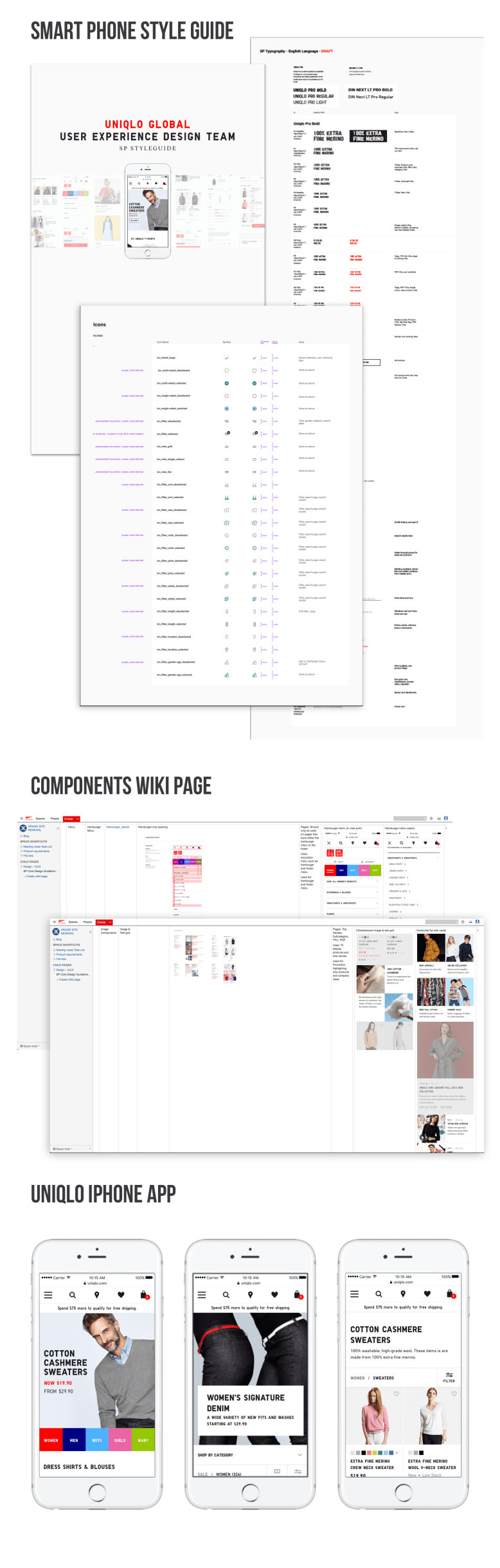
I established a system for Uniqlo’s mobile product grid that could automatically adjust depending on how much product information a country wanted to display. This meant that the code could adapt to various market requirements from Europe to the US. This also made meant that when all countries would migrate to a single backend module the design could be integrated easily.
To support this and other new systems we created, I designed 2 detailed style guides. An online components style guide for the global strategy (Europe, US) and a visual systems guide.
I created and delivered the final smartphone design, style guide and detailed online components directory to the Japanese team for development and launch. The redesign is scheduled for launch in March 2017.
[1] D. (2014, February 23). Why Japanese Web Design Is So… Different. Retrieved February 28, 2017, from https://randomwire.com/why-japanese-web-design-is-so-different/
[2] 7 Things to Know About Japanese eCommerce. (2016, February 04). Retrieved February 28, 2017, from https://www.lyonscg.com/2015/10/20/7-things-know-japanese-ecommerce/
[3] D. (2014, February 23). Why Japanese Web Design Is So… Different. Retrieved February 28, 2017, from https://randomwire.com/why-japanese-web-design-is-so-different/
